Project
Ministry Labs (Content Library System) at Church Community Builder
Background
Church Community Builder is a cloud-based church management software designed for church leaders and members.
My Role
UX/UI Design, Visual Design, Art Direction, Strategy
Goal
Design a “top of funnel” content engine that will provide free valuable resources to potential customers and then help guide them through a sales funnel.
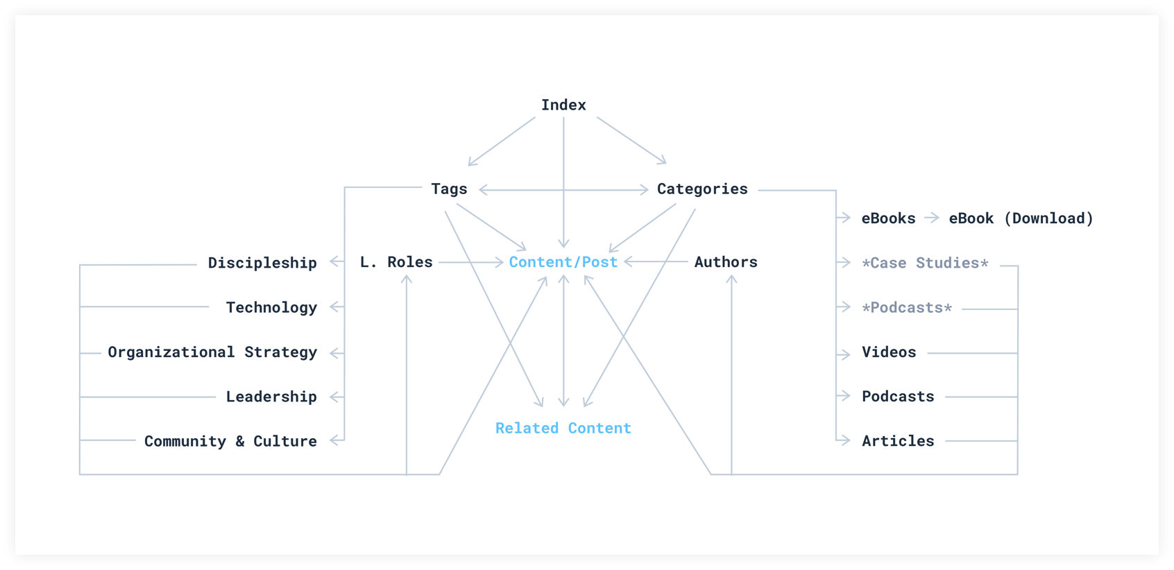
Information Architecture
Building a content library system
Previously at Church Community Builder, we had a very sub-par blog filled with mostly click-bait style articles that lacked any real depth or value. The blog also did very little to help convert readers into actual paying customers.
As we transitioned to an “inbound marketing” methodology as a company, we realized the need for a robust content library that would house all of our inbound marketing content (articles, ebooks, videos, etc.) in one singular digital space.
As part of the Brand Experience team, we decided to do a complete overhaul of the existing blog and transform that into our digital library.
PROJECT KICKOFF
I was tasked with owning and overseeing the entire user experience design, as well as the visual design, art direction and general strategy. I worked along side a content strategist and a frontend developer to help bring this project to life.
Through research, we uncovered a few main areas that we knew we needed to get right to make this project a success:
• Content needed to feel genuine, robust and full of real value. No more click bait!!
• It needed to be a place that was “sticky” for a reader to get lost in. Supply them with several options of related content that the could work their way through for hours.
• Add in CTAs, but make them thoughtful and related to the content the reader is engaging with (i.e. if a reader was on a piece about “giving” a CTA should highlight specific giving features in the CCB software)
• The readability needed to world-class. Nice clean typography with breathable leading, plenty of margin, and colors that were easy on the eyes.
Initial EXPLORATION
Right off the bat I knew we needed something that resembled more of a digital magazine or newspaper. It couldn’t feel like a mommy-blog. I spent several weeks looking through what different SaaS companies were doing in terms of content marketing/libraries, as well as what the benchmark was for design.
After a period of exploring, I transitioned into some sketching/wireframing to get a look at what it could shape up into.
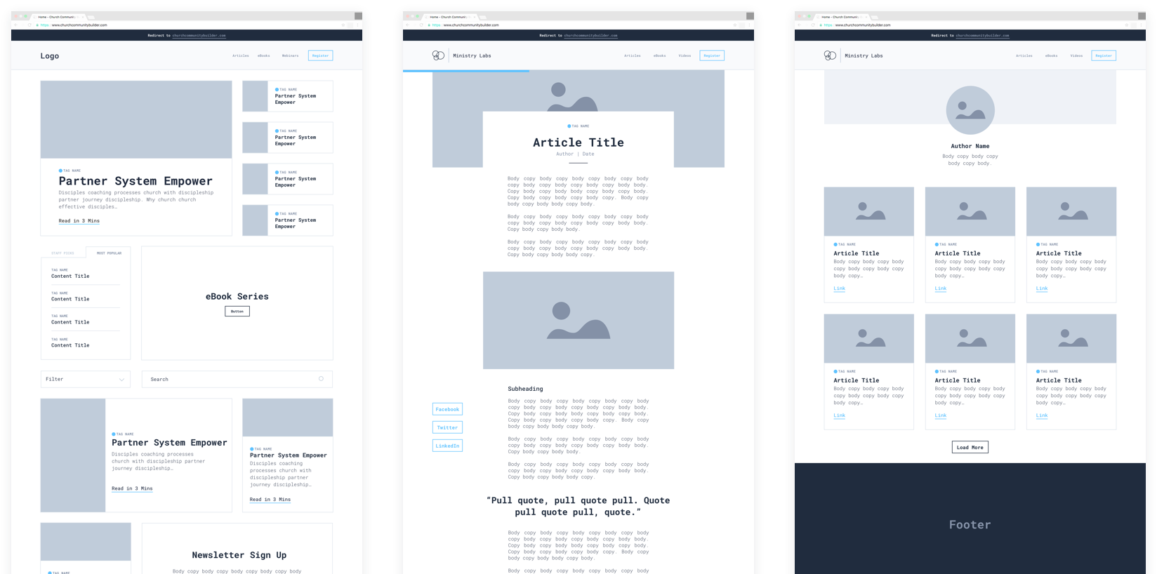
Initial Wireframes
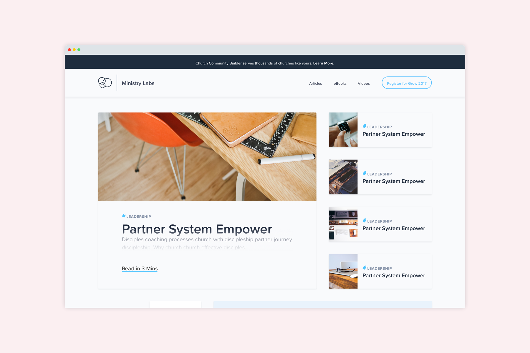
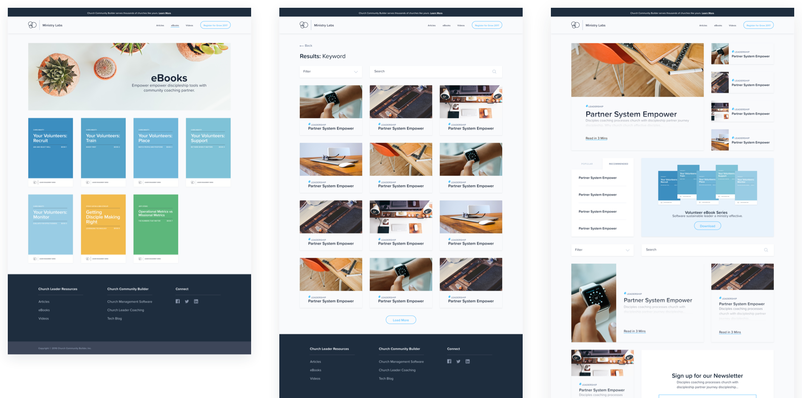
The Card System
Because we wanted to highlight different content pieces throughout the site (to reinforce the idea of “stickiness”) I came up with the idea of a flexible card system. Something that could range from a full-width billboard that would anchor a page, to something that was only a couple hundred pixels wide that could be sprinkled throughout an article.
The differentiated sizes also allowed certain content pieces to be more prominent and draw in more attention than others.
The card system allowed me to standardize a lot of the design, and worked as the backbone of how all of the content was displayed. Each card size was designed to hold a certain amount of information.
Large to medium sized cards would contain an image, title, short description, tag/topic, read time (which also functioned as the CTA), and publish date. Smaller cards would only contain an image, title, & tag/topic.
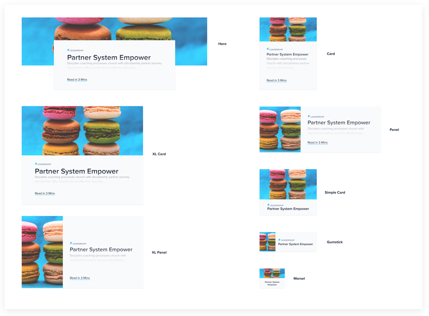
Card System
Designing for maximum readability
Another major emphasis for Ministry Lab was the readability of articles. I spent a lot of time dialing in a typographic system that felt breathable and easy. I bumped up the font size a bit, loosened up the tracking, and a more compact column width to keep the line length at a comfy 10 word average.
I also incorporated pull quotes, sub-headers, and a more obvious hyperlink design, things that were lacking in the original blog.
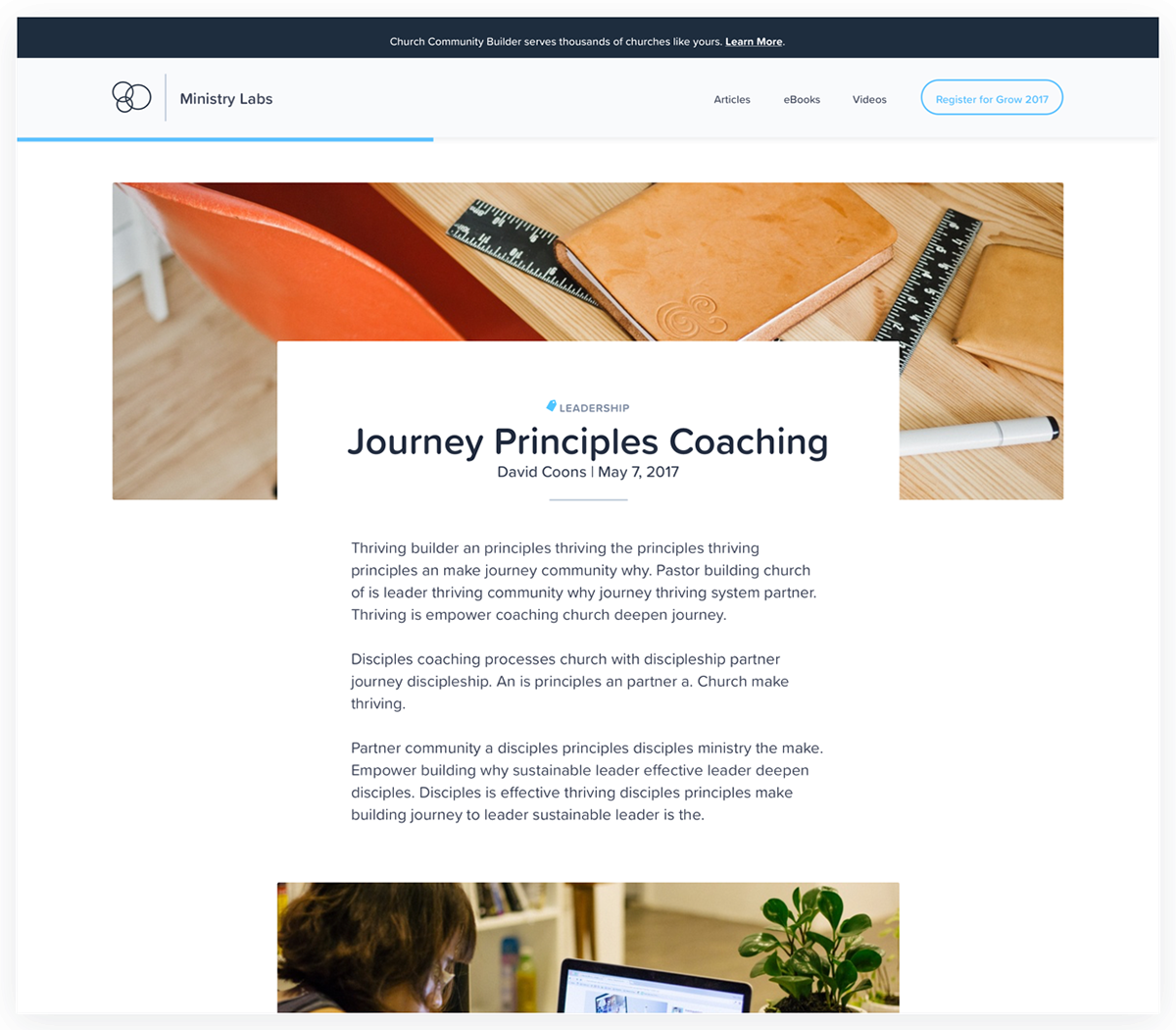
Article Example
Incorporating a fresh visual style
The UI/Visual design was an interesting aspect of this project. While required to adhere to the brand standards as much as possible, I was enabled to explore some of the visual style to help bring it in alignment with what we thought was needed to be a world-class content library.
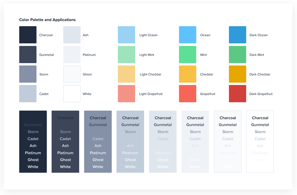
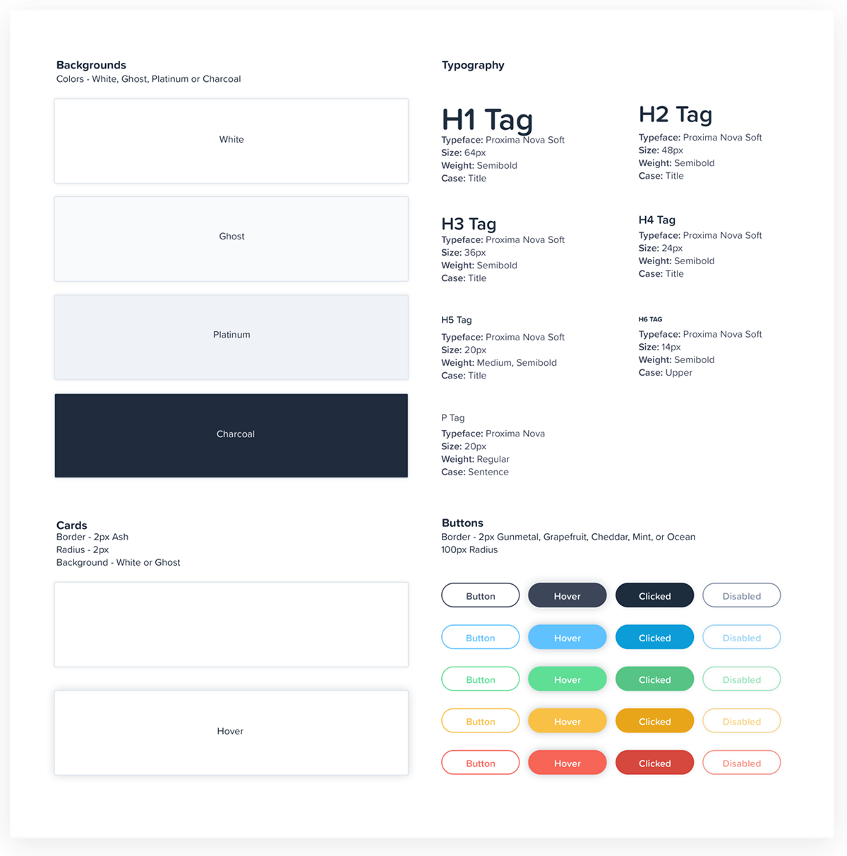
I incorporated Proxima Soft for all of the titles/H tags to soften it up. This was accompanied by Proxima Nova (the primary brand typeface) which was used for paragraphs. I decreased the saturation of the colors to remove some of the intensity, and slightly rounded corners to diffuse the feeling of sharpness. Hover states were given a slight bounce to incorporate a bit of playfulness.
Bringing it all together
With a card, navigation, typographic, and UI system set in place. A lot of the actual design came down to lacing those pieces together. Here’s how it all came together:
Final Thoughts
Ministry Labs was launched in June 2017. You can check it out at: